Lead design on a product now earning millions a year
A safety net for self-custody: an opt-in backup so that losing your seed phrase no longer means losing everything. I designed it end to end, from the first flows through to a funnel rework that lifted acquisition by ~30%.
In self-custody, there's no undo
Self-custody is one of crypto's real advantages — and one of its hardest experiences. Holding your own keys puts the whole burden of not losing them on you: your 24-word seed phrase is the only backup to your wallet, and if you lose both your hardware wallet and that phrase, your funds are gone for good.
Ledger Recover was built for exactly those people: newcomers who want the peace of mind of a backup, just in case. It set out to solve one of the biggest pain points in the space — the quiet, constant fear of losing everything to a single mistake.
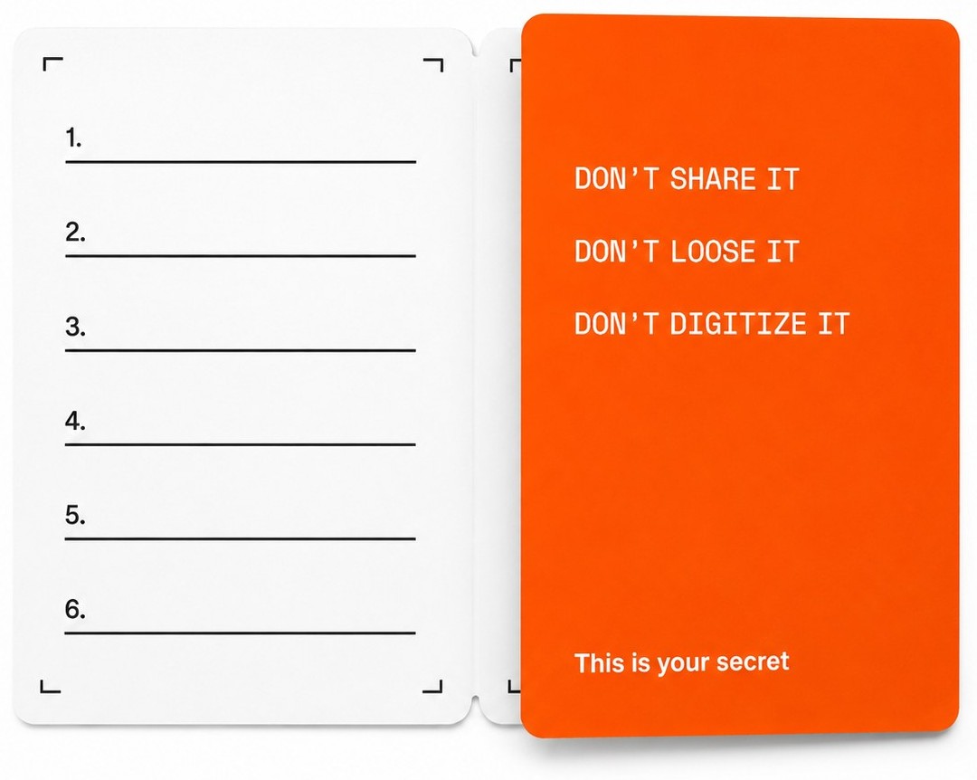
From diagrams, not screens
I joined at the very beginning, as the lead and only product designer — before there was any interface to react to, only the technical diagrams of a security system still being mapped out.
So the experience was designed from those diagrams up, in the same rooms where the architecture was decided — inventing flows for a product that didn't exist yet.
And it was a wide, parallel build: hardware teams (Ledger Stax, Nano, Flex), device software and infrastructure, Ledger Live engineering, and external partners for identity verification and backup. My job was to turn all of that into one flow a person could actually follow.
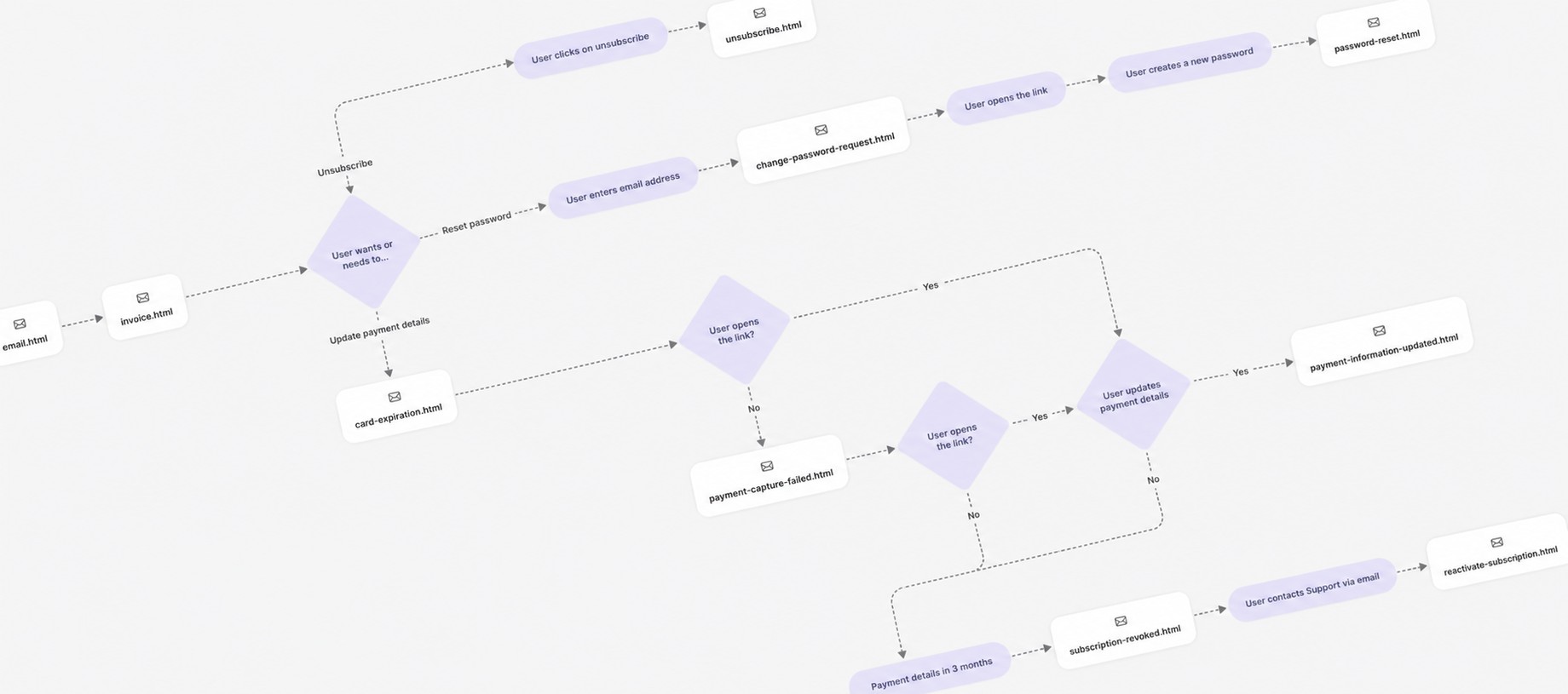
One flow, from Ledger Live to Stax
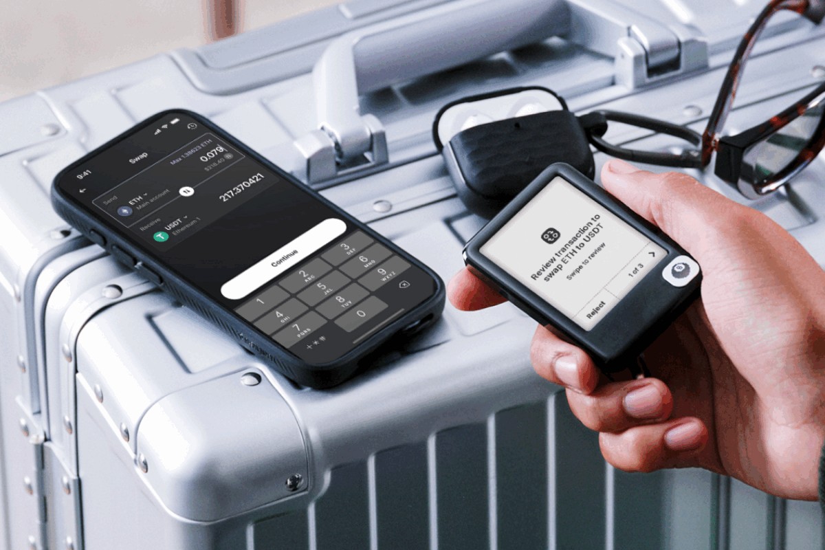
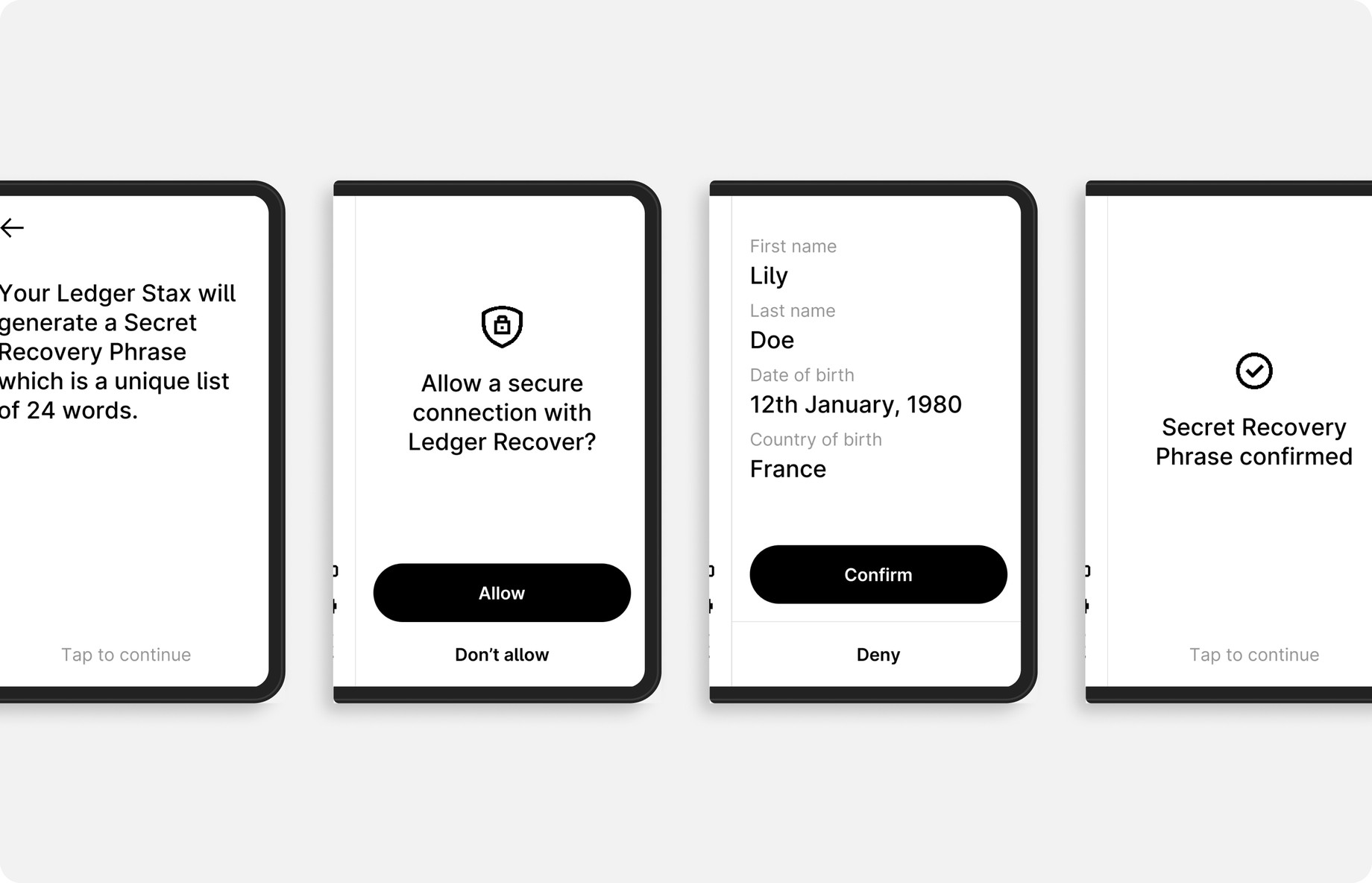
The experience never lived in one place — it runs across two devices at once: the Ledger Live app (on phone or desktop) and the Ledger hardware wallet. The user keeps moving between them — start on the app, confirm on the device, come back — so every step had to stay coherent as it handed off from one to the other, and the constant back-and-forth had to feel like a single, continuous flow.
On the hardware side, the same steps had to hold across Ledger's range of wallets, each with its own screen and firmware limits.
See the full flow in Figma — every Ledger Stax screen, from start to finish.
Reviewed by Tony Fadell
I had the chance to share my work with Tony Fadell (iPod, iPhone, Nest), who was advising Ledger — with one goal: getting the experience validated by him.
His time is precious. Each review was about ten minutes — so those minutes had to count. It meant coming ultra-prepared: diagrams clear enough to read in seconds, yet honest enough to surface every technical constraint and every open problem, never hiding one behind a clean screen.
It got his sign-off — but the bigger shift was scope. We'd been solving inside the app; he pushed us to think about conversion far more broadly, reaching people who weren't Ledger customers yet. That reframed how I approached the whole funnel.

Chasing conversion everywhere
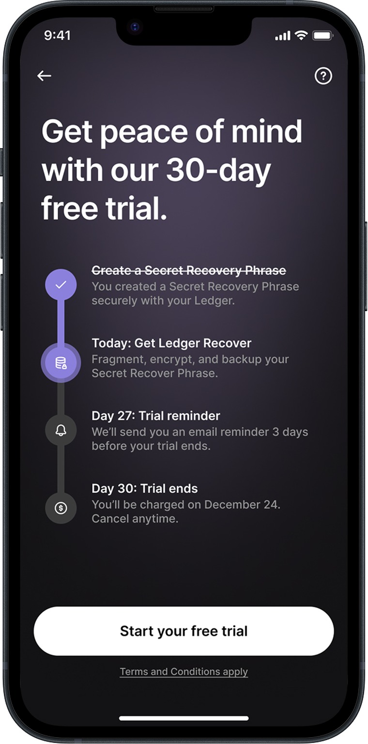
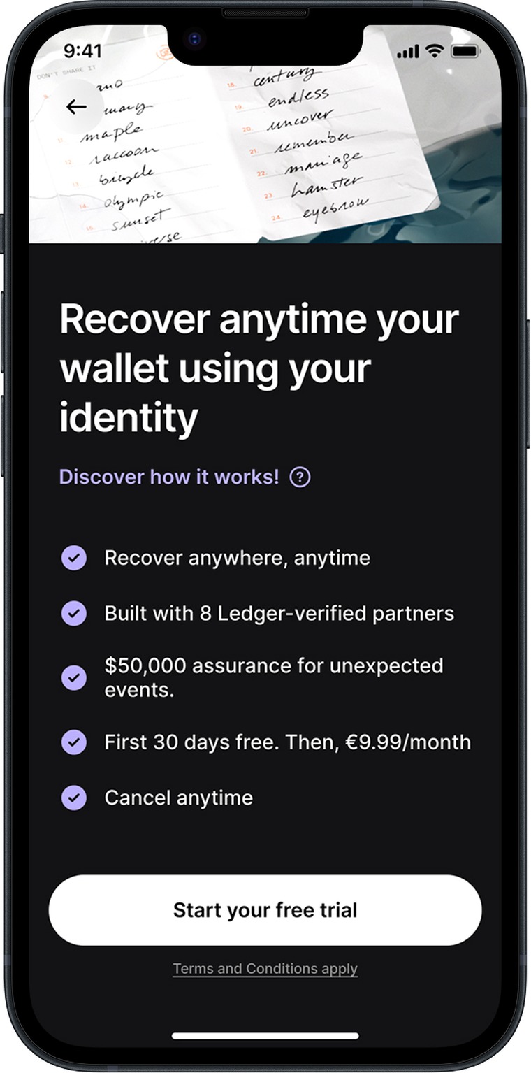
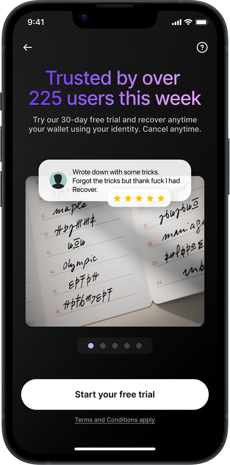
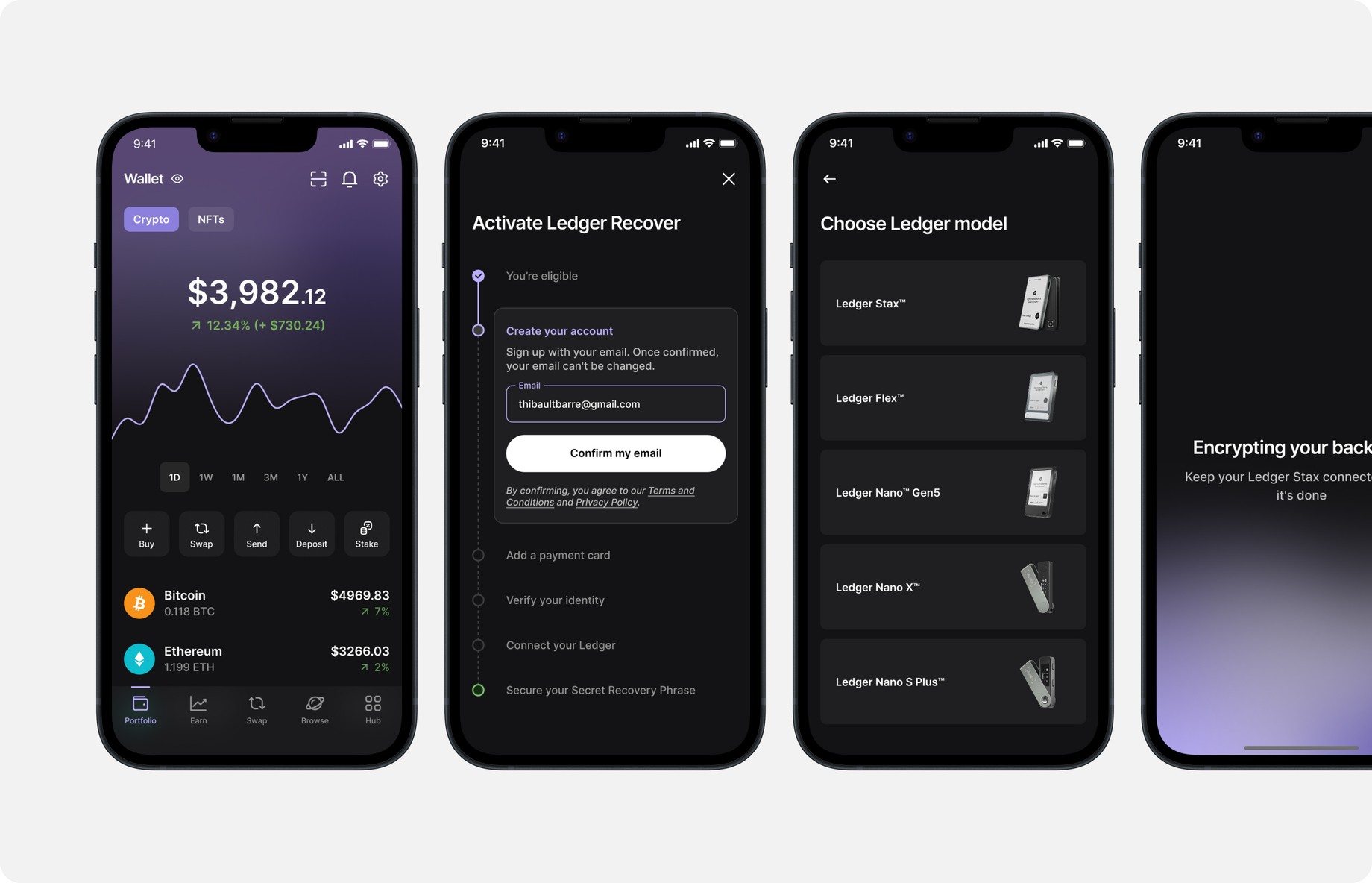
After a successful launch, the focus moved to conversion. Ledger Recover has a long acquisition funnel — from the first entry screen through subscription setup, connecting the Ledger and verifying identity, all the way to activation — and my job became getting people all the way through it.
So I stopped treating it as a single funnel and looked at the whole journey — including how someone who isn't a customer yet first comes across Ledger Recover: on the website, during the hardware-wallet setup, and in between. Each of those became a channel to improve on its own. Across all of them I ran a steady stream of data-driven experiments and A/B tests — several moved the needle, and one redesigned upsell screen alone lifted acquisition by roughly 30%.
Five months in, it had around 4,000 active subscriptions and was still climbing — the start of a product that now generates millions a year.