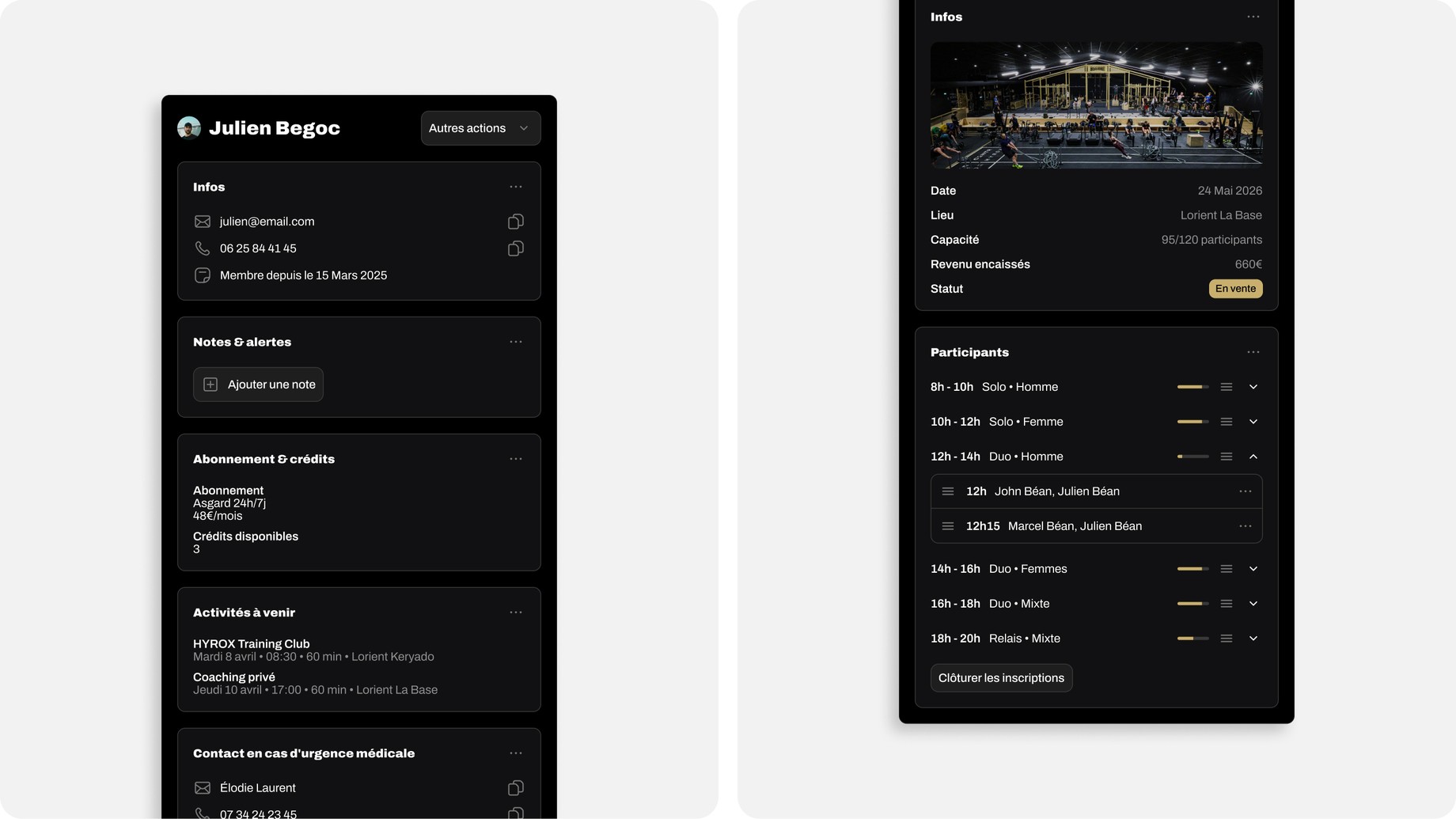
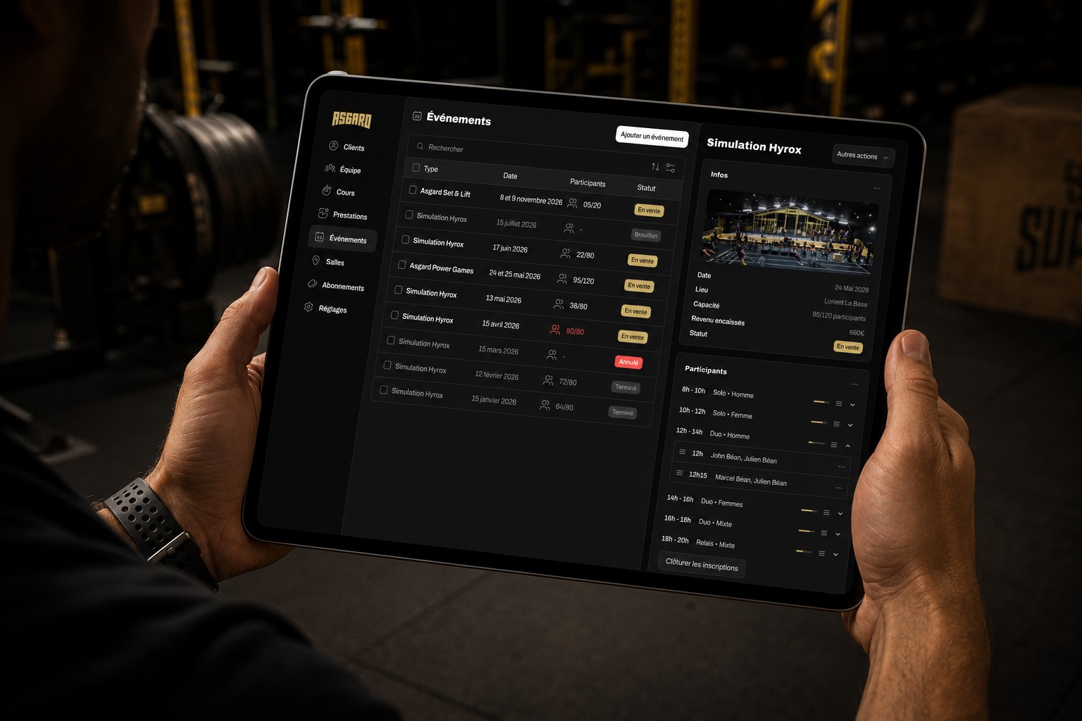
A gym's full product suite, from 0 to 1
Asgard packs CrossFit, Hyrox, weightlifting, osteopathy and VO₂ testing under one roof — but its membership was scattered across a basic app, out-of-app payments and Google Forms. I designed a two-app suite, member and admin, to bring it all into one place.
A great gym, a scattered experience
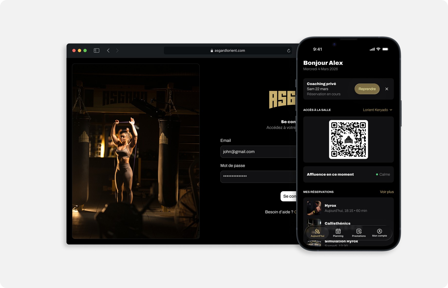
Everything a member needed lived somewhere different — the experience was scattered, and the product I set out to design had one job: turn it into a single tap.
The examples piled up. Buying credits happened outside the app entirely. Signing up for the monthly Hyrox meant a Google Form, then paying through a separate link in another app. Cancelling a class was buried, so members did it late or not at all. And every time a coach's slot changed, the schedule had to be rebuilt manually.
Objectives, not a wish-list
The founder came with real ambition and a long list of ideas. A big part of my role was strategic: turning that into a focused, shippable V1, built around a few clear goals he wanted it to reach.
- Sell more credits and subscriptions — legible pricing and instant checkout to grow sales.
- Roughly halve the team's admin work — event sign-ups, scheduling and member management, from manual to automated.
- Kill out-of-app payments — every payment, from credits to subscriptions to events, handled inside the app.
- Self-serve cancellations — members cancel a class in a tap, without going through the desk.
Making a complex model feel simple
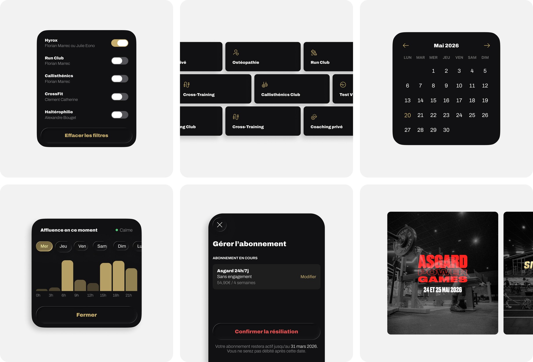
The real design work wasn't the screens — it was the model underneath. Members can subscribe or pay per session in credits; some services can be paid either way, others only in credits; and events like Hyrox pile on their own tiers, guests and rules.
The credits were the trickiest part. They had to stay coherent with the price of every service and with the subscriptions — so buying credits never quietly became a better deal than a plan. Getting that logic right, while keeping the choice dead simple for a member, was the real work behind the calm screens.
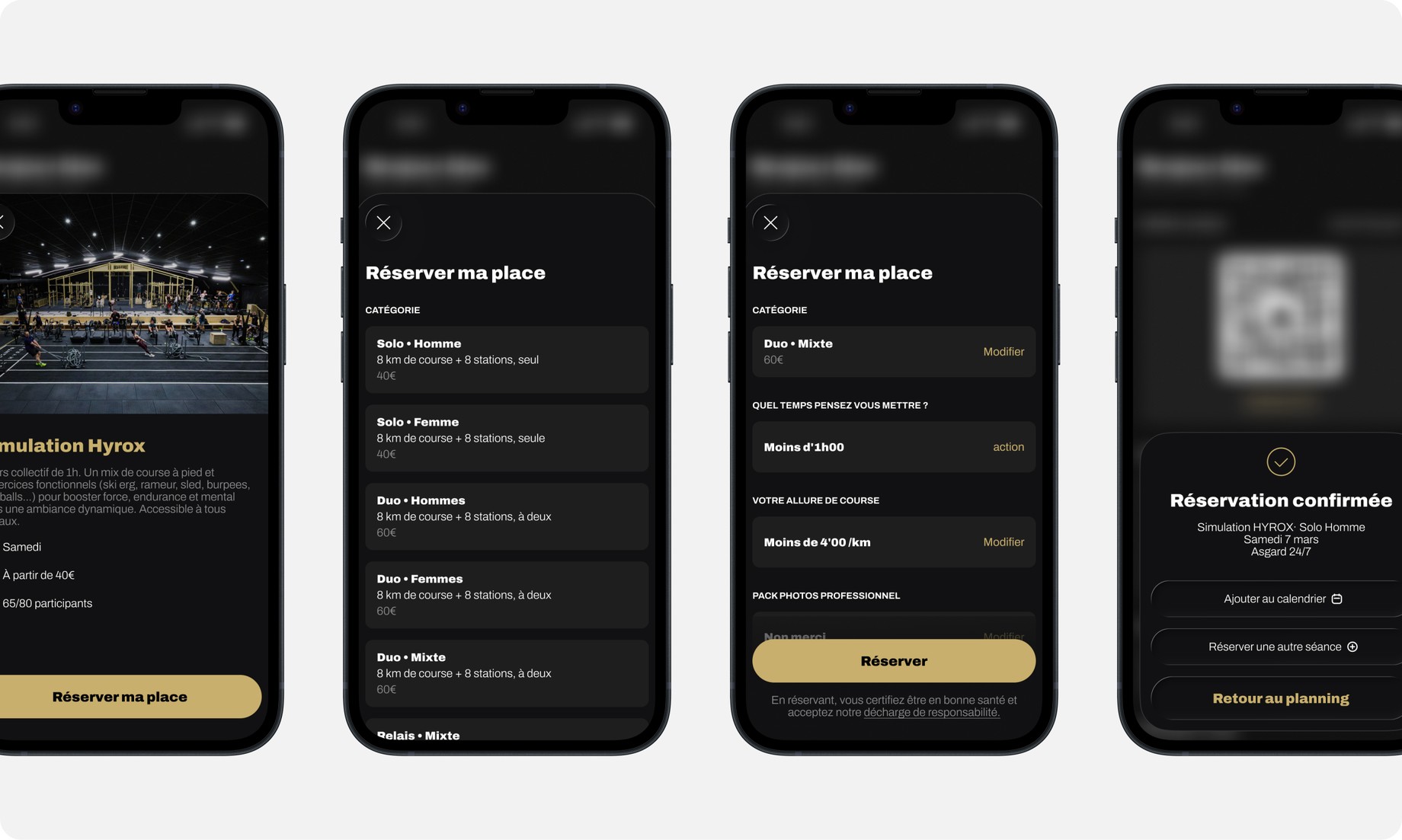
One connected system
The member app and the admin back-office are two sides of the same system — so everything designed on one side had to stay coherent, and actually work, on the other. Add a capability for members and it has to be manageable from the back office; change something for managers and it still has to make sense in the member's hands.
They also live on different devices. The member app ships natively on iOS and Android, designed to each platform's own guidelines so it feels at home on the phone. The admin was built for wherever a manager actually works — comfortable on desktop and iPad, and usable on mobile when needed.